How To Answer Business Questions with Data
Data analysis is the key to driving business decisions and answering questions, but it’s hard to get right
“We have observed a drop in our core metric, what is going on?”
“What are the drivers for churn?”
As data scientists, we encounter questions like these every day. A stakeholder comes across something they want to understand better, and they look to us to take an open-ended question like this and make sense of it.
However, even seasoned data scientists are sometimes stunned by just how vague or open-ended these questions are. As a result, they don’t know where to start or how to carry these analyses forward.
In fact, a lot of analyses either circle high level at 30,000 feet and only scratch the surface, or get stuck in a rabbit hole that’s very far from the original question we hoped to answer.
Like mentioned at the beginning, there are generally two categories of open-ended business questions data scientists encounter:
Questions that are more investigative and aim to identify drivers of a past event; most companies/people refer to this as root cause analysis (e.g. “XX metrics decreased week over week, what happened?”)
Questions that are of exploratory nature and focus on identifying drivers of improvements (e.g. “we want to improve XX metric, what are the things we can do?”)
There are a lot of similarities between how you would carry out these types of analyses, but there are also slight differences.
In this article, I will focus on investigative root cause analysis and:
Share general tips for how to conduct analysis for open-ended questions
Introduce the high level steps for this type of analysis
Go through a hands-on guide for each detailed step
Apply the hands-on guide on a realistic example so you can see how it can be carried out in practice
I will get to exploratory analysis in another article.
General advice & pitfalls to avoid when answering open ended business questions
Have a framework
From my last article, you should already know how much I love frameworks and hopefully learned a little about the common frameworks that DS should apply in their analyses.
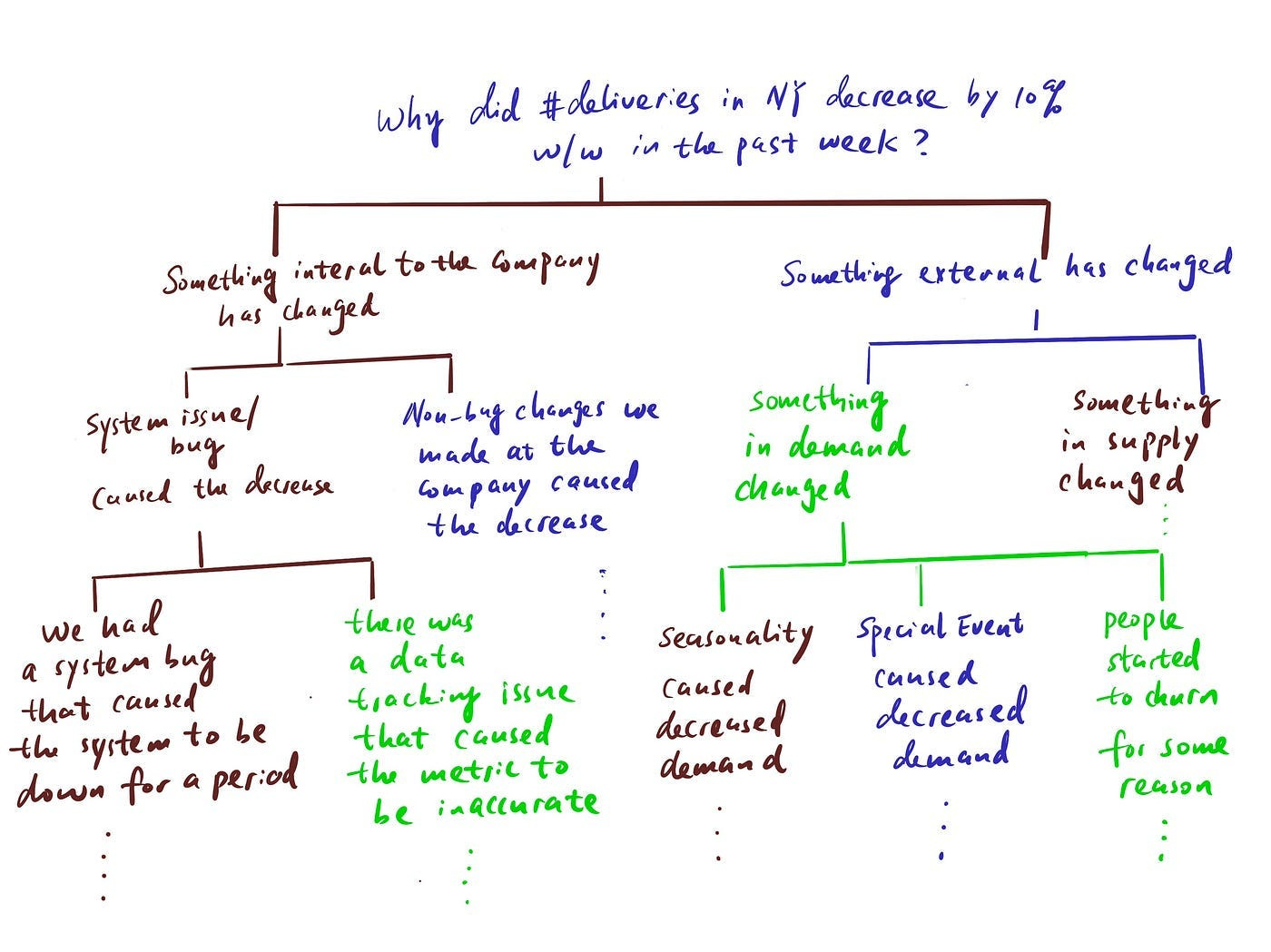
When it comes to investigative work, the most relevant framework is the “hypothesis tree”, where you try to list out all the probable causes of a problem in a MECE way and rule them out one by one until you find the culprit(s).
Don’t expect to get there in a straight line
These types of analysis are hard to do because the process sometimes can be more of an art than strict science. It’s a creative process and it’s guided by curiosity and quality questions/hypotheses.
Because it’s open-ended, there isn’t one predetermined “correct” way to get to the answer. In fact, the steps that will eventually lead us to a conclusion cannot all be planned in advance.
The “hypothesis tree” can only be built out a couple of levels at a time, because you don’t know what insights or patterns you will find in the data and what hypotheses you can reject with the data.
These insights will largely dictate what your next move will be.
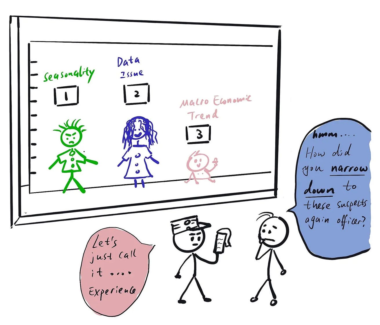
This means you will explore and reject a lot of “not-it” hypotheses along the way. However, these detours are not a waste of time. Doing data-related investigation is not that different from investigations in police work — ruling out “suspects” is a key step in having a thorough investigation, so expect to chase down a lot of dead-end leads before getting to the “lead suspect”.
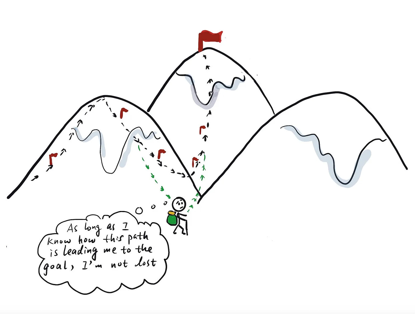
Have your eyes on the goal at all times
This is super important. When I was a junior DS, I sometimes found myself elbow deep in my analysis and only after a couple of hours of exploring found myself wondering “How did I end up here? What am I looking for? How does this help answer my original question?”
It’s important to ask yourself these questions frequently in your process. There will likely be a lot of people with different opinions about what you should look into, and you will have a million data points you could be investigating.
One way to help decide what is worth digging deeper into is to see whether it has a clear lineage to trace back to the ultimate question you want to answer.
Act on curiosity, but don’t let it take you too far down a rabbit hole
Going back to my comparison between data investigation and detective work:
More often than not, when you come across something unexpected, it can lead to a big discovery that will change the course of your investigation. So it’s important to act on curiosity when it comes to this type of analysis — if you see something weird or interesting, dig in and see if there’s anything valuable you haven’t considered.
But remember to utilize the tip above to know when it’s time to call it quits and stop the descent into a rabbit hole. Think about the hypothesis you’re investigating and ask yourself:
Have you seen enough evidence to prove or reject it?
If not, what else do you need to close the loop?
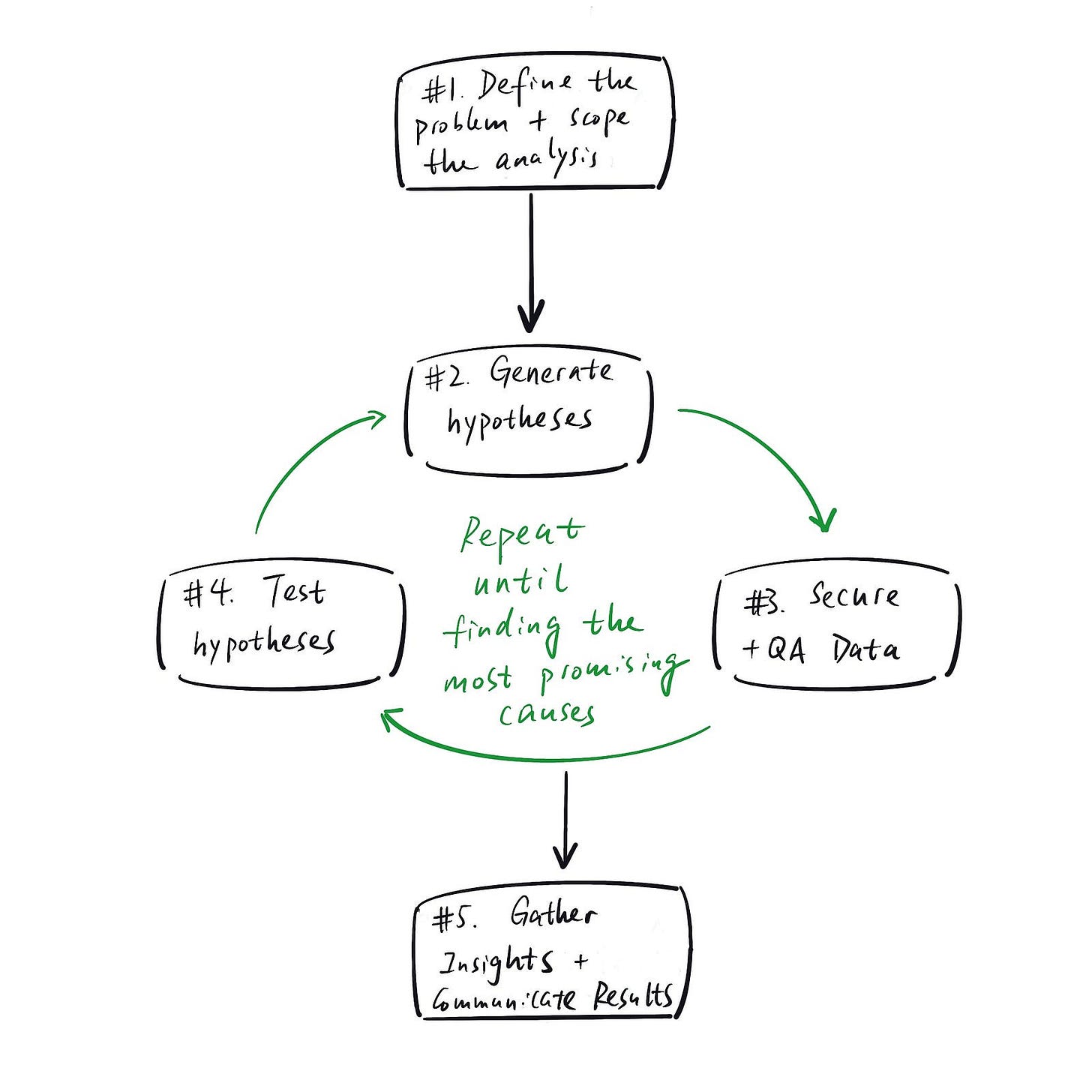
The 5 steps of an analytical investigation
Step 1: Scope the analysis
It’s crucial to understand the business problem at hand so you can set the scope of your analysis. Let’s say your stakeholders asked the following question: “XX metric is down 10%, what caused it?”
In this case, it’s important to understand what the benchmark is (i.e. is it down 10% compared to forecast? Or is it down 10% compared to a previous period?) and what time period is the observation based on.
This will help you decide which time period of data you should be observing, what else you need to understand (for example, if the comparison is to a forecast, you need to understand how the forecast was created) and what hypothesis you can quickly rule out even without data.
Step 2: Generate hypotheses (using a hypothesis tree)
You should always rely on two things in hypothesis generation — your curiosity and a framework.
A framework will get you started with a basic set of hypotheses that can represent the most common issues based on logical reasoning. Your curiosity will then lead you to observe “interesting” things in the data (e.g. counter intuitive findings) that can inspire new hypotheses.
In other words, finding the root cause will be an iterative process. Even if it’s tempting, don’t try to map out the whole hypothesis tree at the beginning (trust me, I have tried, it will quickly fall apart).
As a reminder, this is what a hypothesis tree looks like:
Step 3: Decide what data you need to test the hypotheses, retrieve and QA the data
Once you have a new set of hypotheses developed, the goal is to quickly find ways to validate or reject them so you can move forward to the next iteration of the cycle.
The very key to this is securing the right data and making sure it can be trusted.
Once you get your hands on the data, the first step should never be to jump into hypotheses testing or insights generation — it should be to QA your data.
Because simply put, you should never blindly trust the data you work with. The data gathered in real life is never as clean and structured as Kaggle datasets. The work also doesn’t go to waste; a lot of these QA visualizations and summary statistics can be reused when you pull all the insights and story together in the end.
Some typical QA questions to look into:
Are there any missing/NULL data?
If there are missing/NULL values, is it big enough to be worried about? If it’s a small amount, should you simply ignore those records or delete them if they distort the conclusion you are trying to draw.
Speed often matters more in investigations than perfection.
If it’s a significant amount, did you just discover a data issue? In this case, you should aim to understand why the values are NULL. Is there a legitimate reason why this field wouldn’t have a value in many cases, or is there a problem with the data pipeline?
Once you understand the “why”, you can decide whether it makes sense to replace the NULL values or not.
How is the data distributed, and does it align with your expectation?
It’s a good habit to always pull some useful summary stats of the data you are looking into :
What’s the mean, median, percentiles?
Are there any outliers?
Does the distribution align with your understanding / expectation?
For example, let’s say one of your hypotheses is:
“The Growth team told me we recently increased our email send frequency from once a week to 3 times a week. That might have led to more email unsubscribes, and in turn led to fewer people coming to our website.”
To validate this hypothesis, you pulled email sent/unsubscribe data for the past weeks. Instead of directly looking at whether unsubscribe quantity increased, you might want to check the distributions of emails sent as well.
You might find that some people are receiving way more than the “3 emails per week” you have been told and assumed. That might send your investigation in a completely new direction:
Is this expected behavior? Are the email sequences correctly configured, or could excessive email volume (e.g. because a suppression rule is not working) explain the metric drops you saw?
Step 4: Test hypotheses
Now that you know you have trust-worthy data, you can use it to test the hypotheses you have in mind.
The key here is to decide ahead of time what you need to accept/reject a hypothesis. This can prevent you from randomly exploring and getting distracted, or continuing down a branch of your investigation when you should have already moved on.
There are two components to what’s “sufficient”, one from an academic angle, one from a storytelling angle.
For the academic side, it’s usually best to stick to the standard suite of statistical tools for hypothesis testing (t-test, z-test etc.); I will not cover them in detail here, but likely provide a separate deep dive on experimentation in the future.
The harder piece for most people to figure out is the storytelling angle. What data do you need to create a convincing narrative about what has happened?
Proving something academically through data is one thing; getting all stakeholders on the same page with regards to what’s going on is a whole other challenge.
And in order to convince others, YOU need to form an opinion first. Like I mentioned in my article about the key mindset data scientists should possess, a data scientist’s job is not to simply present data, but to use data to guide decisions.
If you can’t even convince yourself, how can you convince others?
Step 5: Generate and present insights with ranked importance
Once you identify the “smoking gun(s)” and can exit the “hypothesis generation → hypothesis testing” loop, you need to organize your findings and tell a compelling story.
Storytelling with data is another key craft for data scientists to master; it deserves its own article and I will cover it in detail in the future. In the meantime, here are some high-level tips:
My high level suggestion is to ONLY present relevant data points to avoid confusion and distraction. Ask yourself: “What is the simplest, most direct way I can explain what happened?” and then create the story by either writing the headlines for a slide deck or by drafting the outline of a summary document.
Only once you have the storyline in place, you should start to fill in the charts and tables supporting that narrative. This ensures that every piece of data you are showing is crucial for the explanation.
With that being said, all the “dead-end” leads you explored are not wasted. They go into the appendix, and you can point to them when people inevitably ask “have you considered…” / “what about…”.
And all of your data QA? That also deserves a place in the appendix so when people ask questions about the data and its integrity, you can show your in-depth knowledge and the thoroughness of your analysis.
This helps build trust in you and your analysis: Because if you can’t even answer the most basic question about the data you are using, how can I trust the insights you developed?
In this process, it’s important to ask yourself: “What questions would others ask to challenge and poke holes in the narrative?”. If you want to go deeper on this topic, check out the articles on sanity checking your work and anticipating questions from stakeholders by Torsten Walbaum.
Case Study: Investigating why total video view time is down on YouTube
Disclaimer: This is a simplified, made up example for demonstration purposes; all data is fabricated by the author
It’s time to put all of this into practice.
Let’s say you work at YouTube and someone from leadership asks you to dig into why the total video view time is down.
Step 1: Understand the concrete question/issue at hand
First, ask clarifying questions so you are crystal clear about the question you’re answering. For example:
"What time period are we talking about?”
“What’s the benchmark we compare it to when we say the view time is down?”
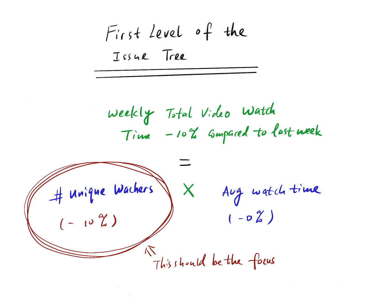
For demonstration purposes, let’s assume we found out that the weekly total video view time is down by 10% compared to last week.
Step 2: Generate hypotheses
Start by laying out the debugging structure (AKA the hypothesis tree) to break the problem into smaller pieces you can tackle. As much as possible, you should follow the MECE principle.
In this case, the first layer of the hypothesis tree is very simple:
Total watch time = number of unique watchers * average watch time
Can we isolate the issue to one of part of that equation?
For this example, let’s assume we can: Average watch time is flat, but the number of unique watchers is down by 10%. Congrats, you just narrowed down your scope for the analysis.
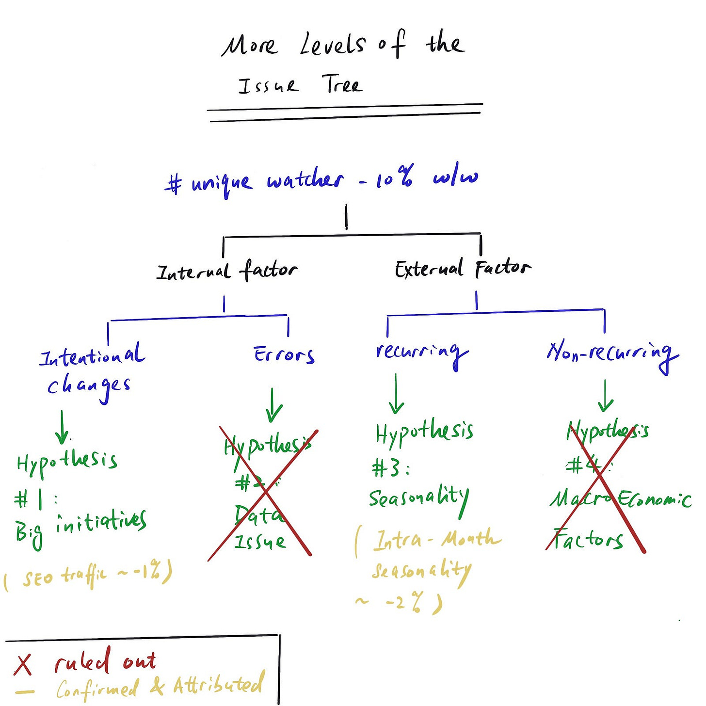
Then one level down, one (of many) MECE way to break down all the factors is “internal factor” (e.g. data error, engineering change etc.) vs. “external factor” (e.g. seasonality, macroeconomic factor etc.). However, you need to be a little more concrete than this to have testable/verifiable hypotheses.
In reality (not in an interview setting), some of the low hanging fruit hypotheses can even be verified without much data retrieval. So it’s crucial to quickly identify and test them.
The hypotheses listed below are some easy-to verify ones that we can quickly rule out or accept:
Step 3 — Step 4: Decide what data you need to test the hypotheses, QA the data if needed, test the hypothesis and attribute the change
You should easily be able to verify if any major initiatives (e.g. new launches) happened in the relevant time frame that could be responsible for tanking the metric.
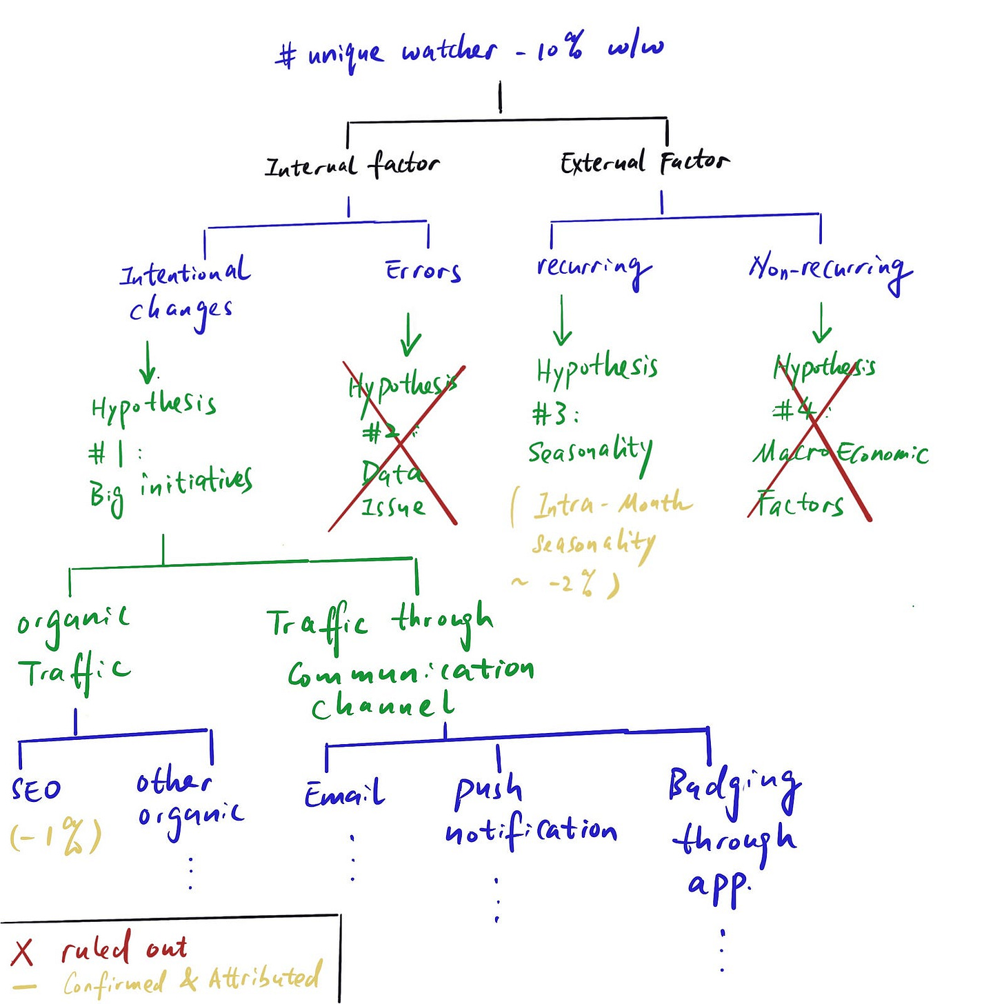
Most companies A/B test big changes, so you should look through the data for recent experiments to see if any can explain the change. Let’s say we see that one of the changes we recently rolled out affected the SEO ranking of our videos on Google, and it caused a reduction in SEO traffic and fewer unique watchers as a result.
We can also quickly verify whether there’s any seasonality at play. In this case, we are looking at weekly aggregated data, so we can disregard intra-week seasonality. The best way to check this is to look at weekly data trends over long time periods (e.g. by plotting different years on top of each other) and see if there are any repeating patterns.
Judging macroeconomic factors is more of an art than science; they are typically not recurring, so you won’t have historical data to use as a benchmark. One way to attribute/estimate the effect of these factors to look at industry or competitor data since macroeconomic developments will affect the market broadly.
For example, during COVID, many retail stores experienced similar dips in foot traffic and revenue.
Repeat steps 2–4 until you can attribute all the changes
While practice problems might make it seem like that, in reality, it’s usually not just one or two factors that caused the change you’re observing. Often, many factors combined explain the metric movement, although some contribute more than others:
So it’s important to treat “hypothesis generation -> hypothesis testing” as a recurring and iterative process until we can explain the whole magnitude of change we observed.
Final Thoughts
Using data to answer business questions is never an easy process. The questions are usually open-ended, and it’s up to you to develop hypotheses and eventually identify the relevant driver(s).
The most important part is to have a framework that you can follow when exploring different possibilities. Otherwise, it’s easy to get lost in an ocean of random guesses and hunches.
And without a way to systematically rule out hypotheses one by one, working groups often forget what they have already concluded and what they still need to test, causing you to go in circles.
Hopefully this article provides you a helpful guide for structured investigations.
Since the final (and arguably most important) step is to package the findings into a convincing story, I will cover data storytelling in my next post. Stay tuned!




this is excellent. I do very similar work to the youtube example and when i am not too lazy to write out a metrics tree / hypothesis tree, i find it extremely helpful. Good motivation to explicitly use framerworks
A fantastic guide, very well articulated and practical! I've been looking for something like it to make a handbook for my data team. Problem solved. :) Would love to hear your thoughts on mastering storytelling.
One important thing to consider during the defining & scoping phase is whether the metric change is meaningful/significant enough to warrant investigation. E.g. Does a 10% drop in total views last week fall outside the range of trivial fluctuations for the metric? We have been adopting a process control framework to add some rigor to our intuition. Here's a wonderful essay from Cedrick Chin if you are curious to dive deeper - https://commoncog.com/becoming-data-driven-first-principles/