How to Better Communicate as a Data Scientist
Most valuable lessons from my time at McKinsey
In my previous post, I made the point that “communicating our work is as important as writing code and building the models and products to get the job done.”
Unfortunately, in reality I have observed a lot of data scientists (especially junior ones) struggling with the story-telling part of the job. They have all the data in hand, but for some reason the message just doesn’t seem to get through to the audience and the analysis ends up being another pretty report on the bookshelf collecting dust with no impact. So what exactly went wrong?
Here are some tips that I have learned over the years that will help you improve your communication as a data scientist.
Always use the pyramid principle
A lot of data scientists communicate in a linear manner (what is demonstrated on the left in the graph below). This is understandable because that’s how we experience things, and also how we tell stories in our everyday lives. But it’s not the most effective way to get important information across because audience can easily get lost or bored in this type of communication.
The gold standard when it comes to communication in business is the pyramid principle — the one demonstrated in the graph on the right. To explain it simply, always start with the most important message — the insights; then drill down to the details.
Similar to headlines of newspaper articles, the insights will grab the audience attention. They are what you ultimately want to get across, so you need to put them front and center. If the audience is interested in the details, they will read (listen) on; if not, they got the most important message.
Clean up the formatting and grammar
This may seem like a nit pick, but let me tell you why it might be more important than you think.
Most of us know Albert Mehrabian’s “7–38–55” rule in verbal communication, which highlights that only 7% of the communication is about the actual content, the rest is composed of tonality (38%) and body language, facial expression etc. (55%). When it comes to written communication, it might not be as extreme, but you can bet that the visual presentation of your work has already communicated the quality of the work in silence.
When people open a doc with numbers and paragraphs that are in different font, not with the right indentation, full of underlines for misspelled words etc., they will likely start doubting the amount of diligence that went into the analysis, and by extension the quality of the conclusions as well.
It’s also disrespectful to the audience; messy formatting puts an additional mental burden on the reader that has to make sense of it all.
So what can you do about it?
The general rule of thumb is make the numbers as digestible as possible and get rid of all the useless details.
Let me use an example to demonstrate what I mean: Let’s say you want to convey insights about the composition of user base in terms of country.
Some data scientists would present something like this:
A couple of very low effort things you can do off the bat:
Change the number format to separate groups of thousand (in Excel / Google Sheets, change to “Number” format and remove the decimal points)
Rank in descending order so that the information is easier to digest
Detailed numbers are harder to grok. Depending on the audience, they likely don’t need that level of detail, so you can even simplify more and express the numbers in thousands instead:
Choose the right chart to get your point across
The type of chart you choose can carry or bury your insight; the chart should act as a visual aid to the audience. Being able to judge what type of chart/table can communicate insights more effectively is a key ability data scientists should possess.
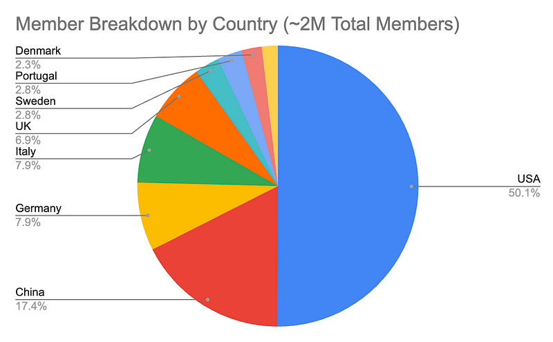
In the example above, likely your ultimate goal is to convey the member base breakdown by country. A pie chart will provide more direct visuals than a table of raw numbers or even a column chart and makes it easier to tell the relative size of each bucket.
Looking at the chart below, even without any narrative, I can visually deduce insights such as “more than half of our member base resides in the USA” or “Germany, UK and Italy have similar amount of users”.
Focus on the important numbers instead of presenting ALL of the numbers
Communication is all about prioritization. You don’t have to include all the numbers just because you have them. You want to help your readers focus instead of distracting them with irrelevant information.
To continue our example, is there really a point of showing the numbers of the long tail? Most likely not. Note that the auto-generated pie chart above hid some of the countries for us already for that exact reason — they are too small to matter, so there’s no point cram them onto the chart.
So a better way to present the data is either to group the long tails together (with a footnote describing what is included in the grouping) or getting rid of it completely (if it’s another type of chart like a distribution and the long tail doesn’t offer any value).
Keep in mind that the ability to tell stories effectively with data doesn’t come naturally without practice. But it is one of the key skills that distinguishes a great DS from good ones.
The best way to practice is by doing. When there’s an opportunity to present, seize it, do dry runs with a teammate or your manager and get feedback before and after the presentation.


Excellent article, Tessa. Plenty of takeaways.